Tuesday, June 26, 2012

Thank You Card

Another project I completed at Sun Graphics was a basic Thank You card from their Pre Press Department to give to valued customers.

 Option 1
 Option 2

4 1/4 x 6 1/4, Basic horizontal fold- one sided

Mailer

This was created during my internship at Sun Graphics Inc. and served as a mailer that would be handed out to every address the mailman had on route. It was 4 1/4 x 6", four color process; with a glossy finish.


Thursday, May 3, 2012

Adobe Software Tutorial

                   
 Before  After

This tutorial showed how to change hair color in Photoshop. First it has you add a hue/saturation adjustment layer and select the colorize option in that dialog box. Then you can slide the saturation or hue to create the color of hair that you would like. After adjusting you will select the mask and hit ctrl + Backspace to fill the layer mask with black. Then you select the brush tool and make sure it is set on white as foreground color and black as the background color. Then you just use the brush to paint where you want the color to show through on the photo, and when there are loose strands lowering the opacity is good.


Source: 

http://www.photoshopessentials.com/photo-editing/hair-color/page-2.php 


Wednesday, April 18, 2012

Adobe Tutorial


 Tutorial

 Mine 

This tutorial taught how to manipulate text using layer styles in Photoshop. First it had you create a new blank layer and change the layer styles. This created the background for the text. It took me through the layer styles of inner shadow, inner glow, satin, gradient overlay, and pattern overlay which selected the background image. Then you were to create a new text, could be anything and go to layer styles and apply styles to it also. Affects applied to it was drop shadow, inner shadow, outer glow, inner glow, bevel and gloss, satin, color overlay, gradient overlay, pattern overlay, and stroke. The stroke was the most detailed and created a gradient stroke and applying color to the stroke. Then the next step was to duplicate the text, clear all the options and go through some minor settings again. This time the stroke was a different color and was meant to set underneath and blend with the top text.  


Source:

http://psd.tutsplus.com/tutorials/text-effects-tutorials/royal-gold-text-effect/

Thursday, April 12, 2012

Final Project

I will be making graduation announcements for a high school senior. The purpose of this is to display to friends and family that the student is graduating so they will be aware of this. It will be sent out from the student so his target audience will be those he wants to view it, his friends and family. There is no specific call to action for a graduation announcement, but to keep the student in their thoughts as he goes through graduation. Some people though when receiving an announcement will send a card, but that is not the call to action for an announcement, because there is not one. The trim size for this will be 7 x 12.5" with a bleed of .125" and .5" margins. To print this they must use 11 x 17 paper and trim it down.  The type if paper I would like to use is uncoated and thicker, white card stock. It will be a four color print job, because there will be photographs in it. To print off two of these it cost $6, three dollars a piece, but for 40 it was $80, basically $1.09 each. They did not quote me a price for 500 or 1000. All images used were taken by me, and the ribbon on the inside spread was downloaded copyright free from wegraphics.net.

Folding Dummy


Thumbnails


Roughs


Outside

Inside
 Final Product, Graduation Announcement 

Thursday, April 5, 2012

Adobe Tutorial

Before

 After 

I chose a how to use the content aware tool in Photoshop. This tool is handy if there is something in your picture that is distracting and it will fill it with elements around it similar to the clone tool, but faster and fills it smoothly. The first step was to create a new layer for the content aware tool to be applied. Then take the polygonal lasso tool and select neatly right around the pole that was distracting in the background. Then, go to Edit-> Fill, and select Content aware, and leave the settings at 100%. Then to remove the post it says to just use the lasso tool and select around it and do the same process to fill it with gravel.


Source:

http://www.photoshopessentials.com/photo-editing/cs5/new-features/fill-content-aware/

Tuesday, April 3, 2012

National Logo Redesign

           Old Logo 


 New Logo

At the beginning of Feburary, JCPenny stores began transforming their old store image into the new one. They have rebranded not only their logo, but their entire store, which is the reason for their new brand. The new marketing strategey and reimaging of the company was the main reason for the logo redesign. The logo, shown above, incorporates the red, white, and blue of our American flag, which was done purposely because it is an American brand, and wanted the flag incorporated into it. It is also a sqaure, which was done to symbolize their "Fair and Square" pricing. The pricing was part of the highlight of JCPenny's store redesign, because they switched from constant sales to everyday low prices. Also the square is meant to give imagery of a square frame, because the thinking behind it was to "remind customers to frame the things they love". They implemented this logo when they rennovated their stores to fit the new look of their everyday low price image. They were able to replace the old logo smoothly, because everything was changing and not just the logo. I do not like the new logo, specifically how it looks on their website. Some of the images look crisper and clean, but the website logo does not look professional. I think that usuing the type, similar to Arial, makes it look cheap and too simple. Frankly, it looks like it took three minutes to create. I think that in the modern age we are in if a company is creating a new logo it should stand out and look "updated". As for the imagery behind it I do not think that anyone will know it even means that. If they want their logo to be a success they need to incorporate their Fair and Square slogan with it in their advertisements and commercials. Even then I would still suggest creating some beveled edges on the square to make it look more like a frame and three deminsional to give it some life.

Sources:

http://ir.jcpenney.com/phoenix.zhtml?c=70528&p=irol-newsCompanyArticle&ID=1652614&highlight
 http://www.blogcdn.com/www.dailyfinance.com/media/2011/02/jcplogo.jpg
http://www.businessinsider.com/jc-penney-adopts-new-logoits-3rd-in-as-many-years-2012-1

Thursday, March 29, 2012

Everyday Design Inspiration


I like how the wheat thins are packaged because they are easy to tell the different kinds apart. The colors relate with the different flavors, and they are clear in their message. They lighten up the background around the things that the company wants to stand out, such as the logo and wheat thin on the top. The typography is clear and it is a food product that is general so a general type is necessary. The logo is just the type and it is decorative enough and similar to how wheat thins are that the type only I like. It is grabbing attention of people by putting that they are made from 100% wheat, which is better for you than other crackers may be, so target audience could be health conscious and call to action to purchase the product. The production process would need a dye cut because of the flap used to close the box on the top.


One thing about products that have multiple flavors is that they usually have a template that they go by. Yoplait has a good template where they can replace the content easily. The color can also be changed for the blue being the light yogurt and red being the normal yogurt. Their logo has been around for a long time and it is easily recognizable on their product. The target audience is health conscious people because it provides the nutritional pluses on the front of the product that highlights the benefits of purchasing the product. The call to action would be to purchase the product. I like how they keep the same template for all of them, even the original and light are in the same fonts. It is printed right on the yogurt can which I think makes it look better.


These are crystal light on the go drinks. The colors are good and the font colors will go with what type of flavor each Crystal Light is. I like the design on the more colorful product, but I do not think  that it gets product across well. It is only clear to me what it is because it is located with the other crystal  lights. The labeling on the left I think displays the product better, and I like how it shows the packets at the bottom so you can see what is inside. The full color ones on the right make it harder to see the logo and highlight more on the pictures on the bottom which could mean it is used for those type of drinks or that is the flavor. The typography is clear on both of them using plain font making it easy to read. The logo is again words which is affective on products because they do not need elaborate labels they will need one that can scale to be small and versatile. The target audience is people who would like to drink flavored water on the go, and with how the labels are, mainly to women. Call to action would be again to purchase the product because that is what food labels intentions are. The packaging is in plastic with a lid, which I like because it is durable and will keep things fresh and more organized than a cardboard box might, and the wrapper is the Crystal Light cover itself, which I think is neat. 


The billboard I like is the "Big Dog" on. I think it gets its point across in a cute way that people would appreciate. Their target audience is anyone, because anyone is a potential bank customer, but specifically people who may want a more common banking experience. Making the "Big Dog" a different color was good because it made it stand out more, and the bold lettering is also good so that people can read it quickly and there is not very much lettering so it gets the point across fast. The placement of this billboard is also important because if it was on the side of the interstate where people are going fast they may not have time to read it all and see the web address, but because it is at a four way stop people have more time to look at it. The call to action is to go to the website and check out Labette Bank, because of the website on the billboard. The logo is also good because it incorporates white in it making the area by the wheat be part of the logo, which I like, reverses in the logo also make it stand out. 

Tuesday, March 27, 2012

Magazine Ad & Billboard


Above are the thumbnails for the magazine advertisement and the billboard.


These are the roughs of my advertisements. On the top is the magazine and the bottom is the billboard.

The magazine ad needed to meet the requirements of Parents magazine for a full page spot. Their specifications were to have a 7.785 x 10.5 " trim size, .5" bleed, and .125" margins for any full page advertisement, that included bleed. The cost of a four color full page ad is $181,480. All images should be converted to CMYK for this magazine ad, and sent as a PDF final file for them to use. The PDF should include any bleed and crop marks. I chose to advertise children's clothing, because the target audience would be women with children viewing this magazine. It would also target them because of the Easter holiday and promote the sale that is going on for the product. Their call to action would be to scan the Microsoft tag that would take them to the website where they could use the discount coupon on the advertisement. A four color full bleed image, an illustrator file, and the four color Microsoft tag are the images used from the master image list.  The image used for the advertisement was photographed by me, and the illustration in the design was used from a copyright free webste, vecteezy.com.

The billboard will be in the same campaign to target mothers or any person with a young child looking for spring clothes. The specifications given were to be 400 pixels x 1400 pixels, resulting in a long rectangle. One thing different from what we have been doing is that the resolution needs to be 72 ppi, which would be bad if we were viewing an image on a small piece of paper, but since it is from far away the less pixels is better because it will appear crisp from far away. I will be doing a four color image from the master image list for this project. The image used will also be photographed by myself.


Billboard

Magazine Advertisement 


Source:
http://www.meredith.com/mediakit/parents/print/rates.html

Thursday, March 15, 2012

Adobe Tutorial

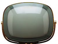
This tutorial showed me how to place an image within another image. I thought this would be useful for design purposes in any advertisement to create something visually interesting. 

  
Before Images


After Image


The steps for this was to place both images in the same photo so it has two layers. Then resize the beach image so it is covering all of the screen of the TV. Then have the television image selected and with the pen tool trace the lens of it all around the screen until it is closed. Then in the paths right click the shape vector mask and select make selection. Then you will select the beach layer and inverse the selection and delete the outside pixels of the image. Then change the blending mode to overlay, and it places the screen over your beach image. 

Source: 
http://photoshoptutorials.ws/photoshop-tutorials/photo-manipulation/blending-two-images-seamlessly-with-photoshop/Page-3.html

Thursday, March 1, 2012

Adobe Tutorial


This tutorial taught me how to use a layer mask to create a in Photoshop.

First you create a new document to the size you want your photo to be. Then select all of the photo and copy and paste it into your new document. To resize the photo you can hold the shift key and drag the corners to make the photo the correct size. They you select the layer mask button, which is on the bottom of your layers panel that looks like a rectangle with a circle in the middle. Then with the layer mask selected next to the photo. Then make sure the foreground color is black and the background is white or transparent. Then select the gradient tool and choose the black to white/transparent gradient. Then drag the "plus" sign of the gradient tool up to where you want the gradient to end on your photo and there you have your fade. I added the text to show that I could use this tool for things such as a magazine cover or brochure. Finally save your document to complete it.


Source:

http://www.adobetutorialz.com/articles/642/1/Fade-Images-in-Photoshop-Using-Layer-Masks

Wednesday, February 29, 2012

Master Image List Description


Along with the descriptions of the master images, there is an example image of what they are next to it. 


Bitmap 

A bitmap image can only be black and white with no shades of gray. A signature scanned in can be a sharp, high resolution bitmap image. Most of the time bitmap images are drawings or things that are scanned in black and white. The file is labeled .bmp for bitmap.


Reverse 

A reverse is anything in print that allows the paper to show through. For example a black background with white “ink”, the “ink” is actually the paper showing through. It can be text, part of an image, illustration, or anything that allows the background to show through as the “white” area.

Vector Art

Vector art does not contain pixels so it can be scaled to basically any size and the image still be crisp. Vector art is created in Adobe Illustrator, and can be any color you want. Although it is created in Illustrator it can be exported as different file formats such as a PDF. Traxson's Rescue logo is also an example of vector artwork. 

Grayscale Raster

A grayscale raster is an image saved in grayscale color mode, which is black and white. Rasters can be saved in different formats such as .gif, .jpg, .tiff, and bmp. The image represents the information which is translated into pixels on the computer. A raster is a basic photograph, and one in grayscale is with the color removed from it.


Duotone Raster

A duotone raster is an image using only two colors, usually black and a spot color. To make a duotone you have your raster image and simply change the mode to grayscale, and then duotone. This format file will be an EPS file.


Silhouette Raster

A silhouette raster is taking an image in Photoshop and outlining it making a silhouette out of it. After having the image outlined that you want to be taken away from the photo and viewed without the background, you will save it as an eps as the last part of creating a silhouette raster. It can be in any color mode.


Full Bleed Raster 
A full bleed raster is any image, saved in tiff, jpg, bmp, that bleeds of a page on all edges. It is a large image that takes up a page and goes to the bleed marks to be trimmed.

Four Color Raster

Is any CMYK raster image. It is called four color because it uses the cyan, magenta, yellow, and black ink to create the image. Can be saved in any of those raster file formats.


Screen Tint

A screen tint pattern has dots that are all the same size and create an even tone. It is a “dulled” color of a spot color, meaning it uses the same color but may not have the same heavy overlay. It could be the color at 50% almost like an opacity.


Sources 

http://meagocomics.files.wordpress.com/2010/11/scanned-bitmap.png

http://www.google.com/imgres?q=example+of+duotone&um=1&hl=en&biw=1246&bih=668&tbm=isch&tbnid=Z9G4A6AdUrcseM:&imgrefurl=http://www.momshots.com/tip-of-the-week/tip-of-the-week-d-is-for-duotone/&docid=HJVZDPNaCHK_sM&itg=1&imgurl=http://farm4.static.flickr.com/3290/2926282568_dd311f8c9d.jpg&w=500&h=332&ei=nNBOT9zRH4eWtwfXqsSkCA&zoom=1&iact=rc&dur=478&sig=105723124279347151164&page=1&tbnh=143&tbnw=205&start=0&ndsp=16&ved=1t:429,r:1,s:0&tx=107&ty=98


McCue, Claudia. Print Production with Adobe Create Suite Applications. 2009. Chapters 11 & 12, ebook version

http://blueisthenewgreen.files.wordpress.com/2009/02/oncorhynchus_keta-11.jpeg

Tuesday, February 28, 2012

Newspaper Ad


The purpose of this assignment is creating an ad for a newspaper. My target audience is someone looking to adopt/own a pet, and find one that can become their friend and love. The ad will give people the information to find out more about adopting a pet and looking in to seeing what animals are available. The budget for this project is $97, so to figure how big of ad you are able to get you will need to know the column width then times the height and price per inch would be $4. So the formula is column inches x height x $4 to figure budget, and the Indesign file would be the actual inches x actual height inches. After figuring up the costs I can either do a 3 column x 8" ad or a 4 column x 6" ad, which would both cost $96 to run in the newspaper. It must be black and white only, and use a bitmap image. My bitmap images, which are on my master image list, is my cat and puppy that where hand drawn by me and scanned in to become a bitmap. The logo is also a vector image, the QR code is a photoshop raster image, and the icons are also a raster image.  


Final Newspaper Ad
Copyright: My bitmap images were hand drawn by me. The logo was created in Illustrator and the vector icons where free from Elements to Use from my instructor.