Thursday, March 29, 2012

Everyday Design Inspiration


I like how the wheat thins are packaged because they are easy to tell the different kinds apart. The colors relate with the different flavors, and they are clear in their message. They lighten up the background around the things that the company wants to stand out, such as the logo and wheat thin on the top. The typography is clear and it is a food product that is general so a general type is necessary. The logo is just the type and it is decorative enough and similar to how wheat thins are that the type only I like. It is grabbing attention of people by putting that they are made from 100% wheat, which is better for you than other crackers may be, so target audience could be health conscious and call to action to purchase the product. The production process would need a dye cut because of the flap used to close the box on the top.


One thing about products that have multiple flavors is that they usually have a template that they go by. Yoplait has a good template where they can replace the content easily. The color can also be changed for the blue being the light yogurt and red being the normal yogurt. Their logo has been around for a long time and it is easily recognizable on their product. The target audience is health conscious people because it provides the nutritional pluses on the front of the product that highlights the benefits of purchasing the product. The call to action would be to purchase the product. I like how they keep the same template for all of them, even the original and light are in the same fonts. It is printed right on the yogurt can which I think makes it look better.


These are crystal light on the go drinks. The colors are good and the font colors will go with what type of flavor each Crystal Light is. I like the design on the more colorful product, but I do not think  that it gets product across well. It is only clear to me what it is because it is located with the other crystal  lights. The labeling on the left I think displays the product better, and I like how it shows the packets at the bottom so you can see what is inside. The full color ones on the right make it harder to see the logo and highlight more on the pictures on the bottom which could mean it is used for those type of drinks or that is the flavor. The typography is clear on both of them using plain font making it easy to read. The logo is again words which is affective on products because they do not need elaborate labels they will need one that can scale to be small and versatile. The target audience is people who would like to drink flavored water on the go, and with how the labels are, mainly to women. Call to action would be again to purchase the product because that is what food labels intentions are. The packaging is in plastic with a lid, which I like because it is durable and will keep things fresh and more organized than a cardboard box might, and the wrapper is the Crystal Light cover itself, which I think is neat. 


The billboard I like is the "Big Dog" on. I think it gets its point across in a cute way that people would appreciate. Their target audience is anyone, because anyone is a potential bank customer, but specifically people who may want a more common banking experience. Making the "Big Dog" a different color was good because it made it stand out more, and the bold lettering is also good so that people can read it quickly and there is not very much lettering so it gets the point across fast. The placement of this billboard is also important because if it was on the side of the interstate where people are going fast they may not have time to read it all and see the web address, but because it is at a four way stop people have more time to look at it. The call to action is to go to the website and check out Labette Bank, because of the website on the billboard. The logo is also good because it incorporates white in it making the area by the wheat be part of the logo, which I like, reverses in the logo also make it stand out. 

Tuesday, March 27, 2012

Magazine Ad & Billboard


Above are the thumbnails for the magazine advertisement and the billboard.


These are the roughs of my advertisements. On the top is the magazine and the bottom is the billboard.

The magazine ad needed to meet the requirements of Parents magazine for a full page spot. Their specifications were to have a 7.785 x 10.5 " trim size, .5" bleed, and .125" margins for any full page advertisement, that included bleed. The cost of a four color full page ad is $181,480. All images should be converted to CMYK for this magazine ad, and sent as a PDF final file for them to use. The PDF should include any bleed and crop marks. I chose to advertise children's clothing, because the target audience would be women with children viewing this magazine. It would also target them because of the Easter holiday and promote the sale that is going on for the product. Their call to action would be to scan the Microsoft tag that would take them to the website where they could use the discount coupon on the advertisement. A four color full bleed image, an illustrator file, and the four color Microsoft tag are the images used from the master image list.  The image used for the advertisement was photographed by me, and the illustration in the design was used from a copyright free webste, vecteezy.com.

The billboard will be in the same campaign to target mothers or any person with a young child looking for spring clothes. The specifications given were to be 400 pixels x 1400 pixels, resulting in a long rectangle. One thing different from what we have been doing is that the resolution needs to be 72 ppi, which would be bad if we were viewing an image on a small piece of paper, but since it is from far away the less pixels is better because it will appear crisp from far away. I will be doing a four color image from the master image list for this project. The image used will also be photographed by myself.


Billboard

Magazine Advertisement 


Source:
http://www.meredith.com/mediakit/parents/print/rates.html

Thursday, March 15, 2012

Adobe Tutorial

This tutorial showed me how to place an image within another image. I thought this would be useful for design purposes in any advertisement to create something visually interesting. 

  
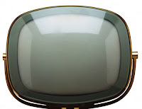
Before Images


After Image


The steps for this was to place both images in the same photo so it has two layers. Then resize the beach image so it is covering all of the screen of the TV. Then have the television image selected and with the pen tool trace the lens of it all around the screen until it is closed. Then in the paths right click the shape vector mask and select make selection. Then you will select the beach layer and inverse the selection and delete the outside pixels of the image. Then change the blending mode to overlay, and it places the screen over your beach image. 

Source: 
http://photoshoptutorials.ws/photoshop-tutorials/photo-manipulation/blending-two-images-seamlessly-with-photoshop/Page-3.html

Thursday, March 1, 2012

Adobe Tutorial


This tutorial taught me how to use a layer mask to create a in Photoshop.

First you create a new document to the size you want your photo to be. Then select all of the photo and copy and paste it into your new document. To resize the photo you can hold the shift key and drag the corners to make the photo the correct size. They you select the layer mask button, which is on the bottom of your layers panel that looks like a rectangle with a circle in the middle. Then with the layer mask selected next to the photo. Then make sure the foreground color is black and the background is white or transparent. Then select the gradient tool and choose the black to white/transparent gradient. Then drag the "plus" sign of the gradient tool up to where you want the gradient to end on your photo and there you have your fade. I added the text to show that I could use this tool for things such as a magazine cover or brochure. Finally save your document to complete it.


Source:

http://www.adobetutorialz.com/articles/642/1/Fade-Images-in-Photoshop-Using-Layer-Masks